CCRW Brand Assets
The Canadian Council on Rehabilitation and Work (CCRW) brand assets page provides access to official logos, colour specifications, and brand guidance for partners, employers, media organizations, and event organizers. Use the approved assets below to ensure consistent representation of CCRW across digital, print, and promotional materials.
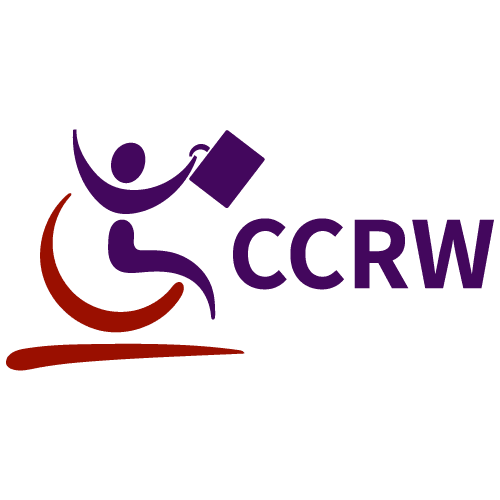
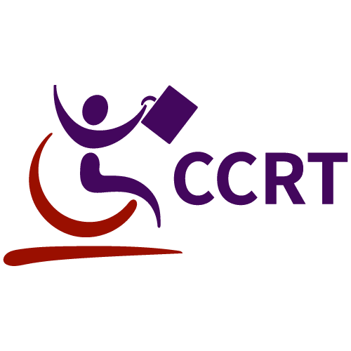
Official Logos
The CCRW logomark conveys active participation in the workforce, supported by a bold, accessible wordmark designed for clarity and impact. Together, these elements combine movement and structure to express both individual empowerment and systemic change.
Our logo should appear on all CCRW assets and partner-facing materials with the appropriate language version (English or French) based on context. As a general rule, the primary full-colour logo should be used whenever possible. The white logo variation should only be used when colour contrast, accessibility, or background considerations make the full-colour logo difficult to read. The logo should not be altered, stretched, recoloured, or modified without approval. For alternate file formats, please contact our Marketing team.
Small Size
Minimum sizes are provided for digital applications to preserve clarity and legibility. As a general guideline, the CCRW logo should not appear smaller than 120 px wide (approximately 1.25 in / 3.2 cm), and the CCRW logomark should not appear smaller than 68 px wide (approximately 0.71 in / 1.8 cm).
120px width
68px width
Colours
CCRW uses a defined and consistent colour palette to support accessibility, clarity, and strong visual contrast across materials.
CCRW’s primary colours, Dark Amethyst and Violet, reinforce brand recognition and highlight key messaging. Secondary colours, Lilac Ash and Pale Slate, support layout, balance, and visual hierarchy. Penn Red is a CCRW-exclusive accent colour used to reinforce the organization’s core identity and should be applied selectively for emphasis.
Need Additional Assets?
For campaign-specific logos, alternate file formats, media resources, or questions about logo use, contact CCRW’s Marketing team. We’re happy to help ensure the correct assets are used consistently across digital, print, and promotional materials.